The photos that mosaic best.
A mosaic is essentially a posterised version of your photo. The clearer the original, the better the mosaic. Here's what to aim for — and what to avoid.
Bad vs good, at a glance
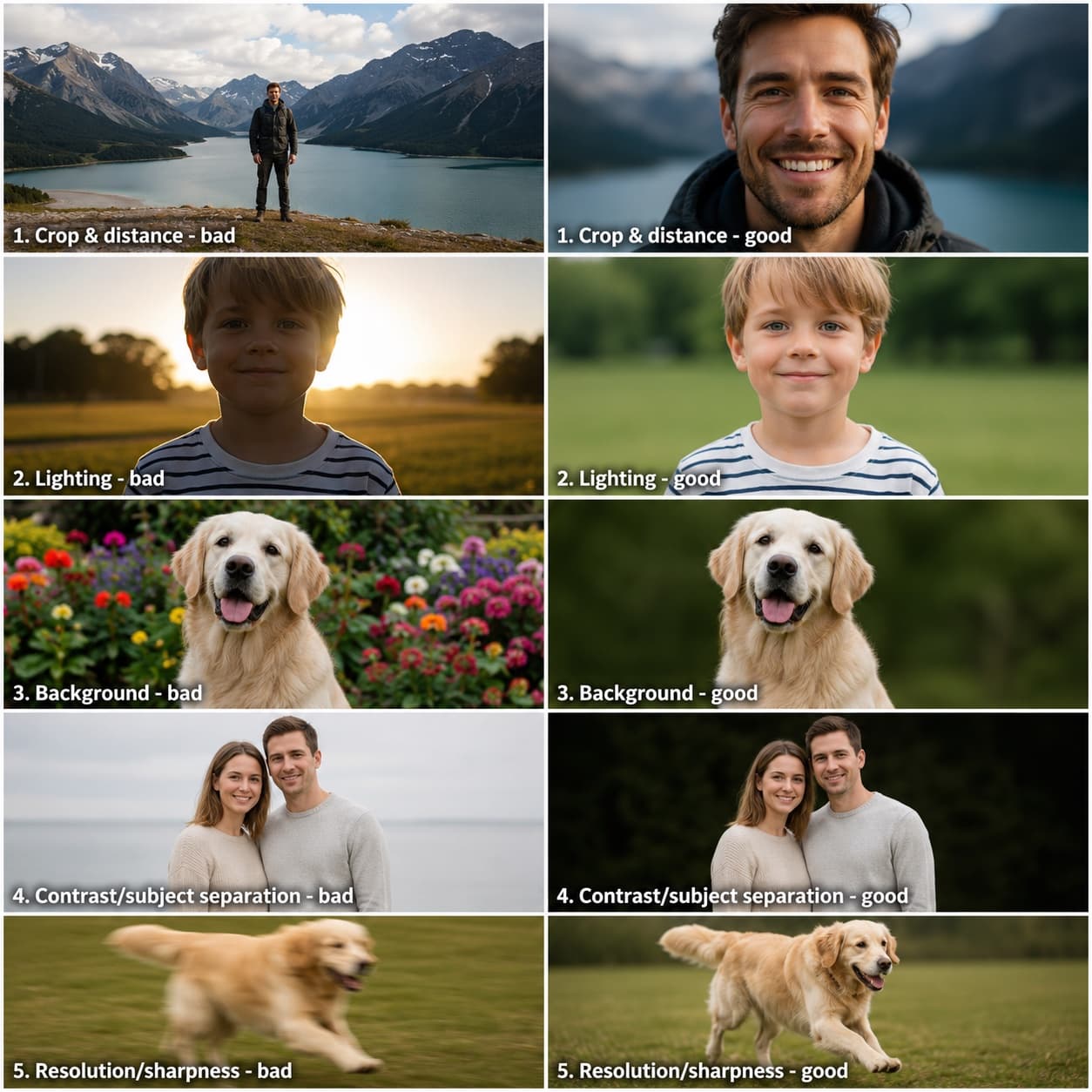
The same five things, shown each way — a weaker version on the left, a stronger one on the right: crop & distance, lighting, background, contrast & subject separation, and resolution & sharpness.
The four things that matter
Almost everything that makes a mosaic look great comes down to four properties of the source photo. In rough order of importance:
- Tight crop on the subject.The face (or whatever the subject is) should fill at least half the frame. Wider crops waste pixels on background detail that doesn't help.
- Even, soft lighting. Window light or overcast outdoor is ideal. Harsh sunlight creates blown highlights and deep shadows that read as flat black or flat white in the mosaic.
- Plain background. A clean wall, sky, or a softly blurred backdrop. Busy backgrounds eat colour bricks that would have made the subject look better. (Or use our Remove background feature — see below.)
- Decent resolution.1500px on the short side or better. Your phone shot is almost always fine. A small thumbnail copied from social media often isn't.
What works brilliantly
- Pet portraits. Head-and-shoulders, ideally with the eyes catching light. The single most popular Mosaicify subject.
- Baby and child portraits. Close-up, front-facing, mouth either fully open laughing or relaxed. Slight smiles can read as a flat line at low resolutions.
- Studio shots. Graduation photos, headshots, professional family portraits. The lighting work is already done for you.
- Wedding portraits. Couple close-up, ideally outdoor or near a window.
- Cars, bikes, motorcycles. Solid colour, hard edges. Read very well in mosaic form.
What to avoid
- Group photos with many small faces. At our resolutions each face gets 10–20 bricks. Three people works; ten people is a blur.
- Distant subjects. Anything where the subject takes up less than a third of the frame.
- Backlit photos. Subject in shadow against a bright sky. The subject will quantise to dark grey/black with no facial detail.
- Heavily filtered Instagram exports. Re-saturation, vignettes and grain confuse the colour matching. Use the original whenever possible.
- Old printed photos scanned at low resolution.If you can see the JPEG blocks, it's too small. Try to scan at 600 DPI or higher.
The Mosaicify controls you should know about
On the create page, after you upload a photo, several controls help you compensate for a less-than-perfect source:
Auto-tune
Runs once on upload and once per click. Analyses your photo's histogram and picks gentle defaults for Detail / Brightness / Contrast / Saturation. About 70% of the time this is all you need. Click it again any time to start fresh.
Detail
Sharpens edges before the photo is quantised to bricks. Helps faces look defined rather than blurry. Push it higher (40–60) for soft photos; lower (10–20) for already-sharp ones.
Brightness / Contrast
Standard photo controls. Use Brightness to lift a too-dark photo or pull down a blown-out one. Use Contrast to add punch to flat-looking photos — most mosaics benefit from +10 to +25.
Saturation / Temperature
Saturation makes colours more or less vivid. Temperature warms (positive) or cools (negative). Use Temperature to remove yellow casts from indoor LED lighting or blue casts from shade portraits.
Remove background
AI-powered cutout that drops a clean brick colour behind your subject. Particularly striking on portraits — try a deep navy, bright lime, or hot pink. The Edge slider controls how aggressive the cut is: slide right if ears or hair are getting trimmed.
Max colours
Caps the palette at the N most-used bricks. The default is 26 for the three standard sizes, rising to 32 on the largest size, Large (80×80). Past that point the extra colours mostly serve clusters of three or four studs, the build slows down, and the result looks identical to a metre away. Slide it up if you want more variety (max 32), or down for a bolder, more poster-like look.
If you're still stuck
The preview on the create page is honest — what you see is exactly what we'll ship. If the preview looks bad with your photo, no amount of slider-fiddling will rescue it. The best fix is almost always to pick a different photo: closer crop, brighter light, plainer background.
We're happy to look at a photo and give you an opinion before you order — send it to hello@mosaicify.co.uk and we'll reply within a day.